Category: Website Design

  • Will AI Replace Web Designers? What Businesses Should Know in 2026

    Will AI Replace Web Designers? What Businesses Should Know in 2026

    Artificial Intelligence is transforming the way websites are designed and developed. From AI website builders to automated design tools, creating a website has become faster and more accessible than ever.

    But this raises an important question for businesses:
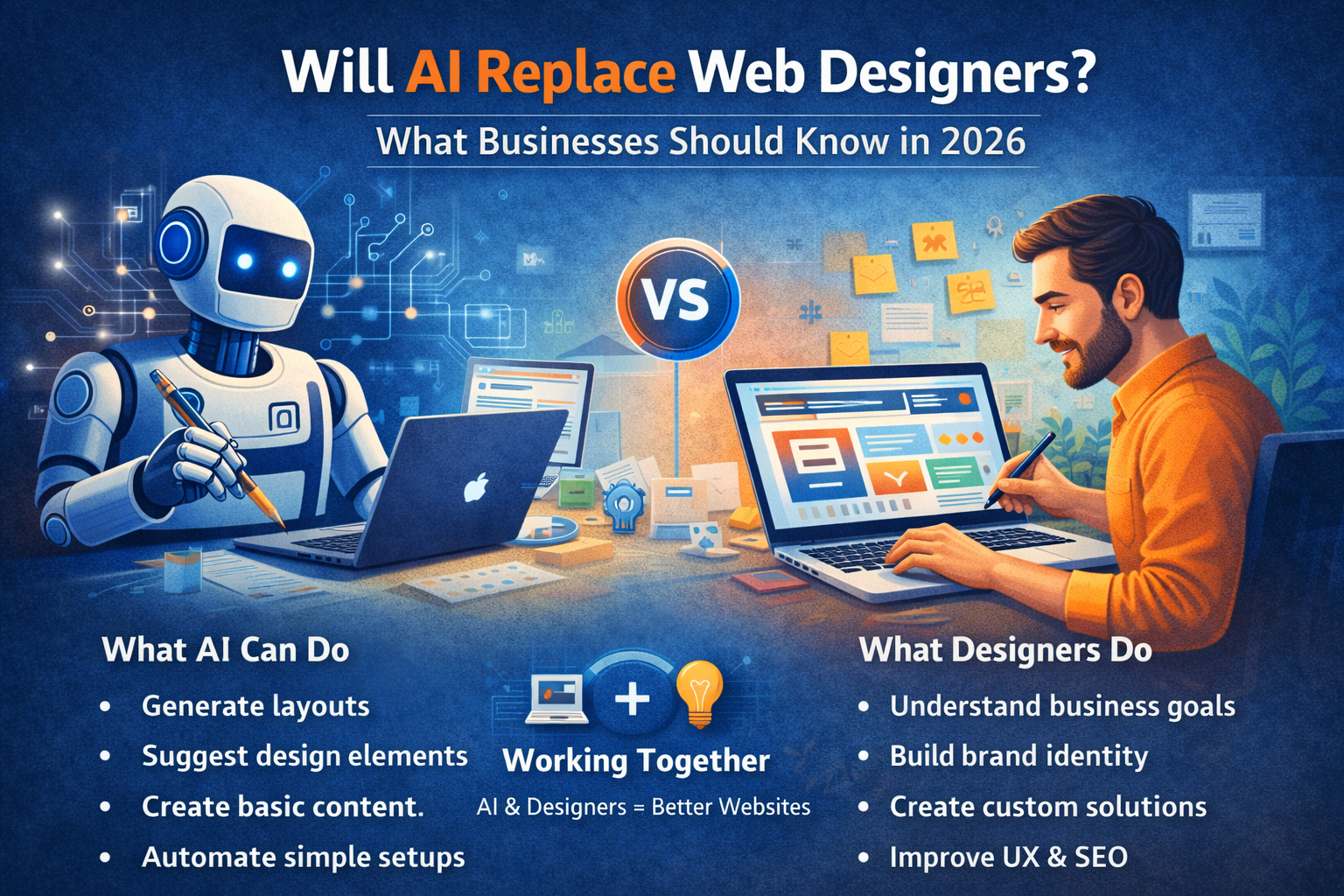
    Will AI replace web designers in 2026?

    The short answer is — No. But it will change their role significantly.

    Let’s understand how.

    What AI Can Do in 2026

    AI-powered tools can now:

    • Generate website layouts instantly
    • Suggest design elements and color schemes
    • Create basic content and images
    • Automate simple website setups
    • Optimize layouts based on user behavior

    These tools are useful for quick, basic websites and small projects.

    Where AI Falls Short

    Despite its capabilities, AI still has limitations.

    AI cannot:

    • Understand your unique business goals deeply
    • Build brand identity and emotional connection
    • Create strategic user journeys
    • Deliver fully customized solutions
    • Replace human creativity and decision-making

    AI works based on data — not true understanding.

    Why Businesses Still Need Web Designers

    A professional web designer does more than just design a website.

    They:

    • Understand your business and target audience
    • Create conversion-focused layouts
    • Plan user experience and navigation
    • Ensure SEO, performance, and scalability
    • Customize features based on your needs

    A designer builds a strategy-driven website, not just a template.

    AI + Web Designers = The Future

    In 2026, the best results come from combining AI with human expertise.

    Web designers use AI to:

    • Speed up design processes
    • Analyze user behavior
    • Improve performance
    • Automate repetitive tasks

    This allows designers to focus more on creativity, strategy, and results.

    The Risk of Fully AI-Built Websites

    Relying only on AI tools can lead to:

    • Generic designs that look similar
    • Limited customization
    • Poor brand differentiation
    • Weak SEO structure
    • Lower conversion rates

    Businesses that want to grow cannot rely solely on automation.

    What Businesses Should Do in 2026

    Instead of replacing designers, businesses should:

    • Use AI as a supporting tool
    • Invest in professional web design
    • Focus on user experience and performance
    • Build a website tailored to their goals

    The goal is not just to build a website — but to build one that performs.

    Final Thoughts

    AI is changing the web design industry, but it is not replacing web designers. It is making them more powerful and efficient.

    In 2026, the real advantage lies in combining technology with human expertise.

    At Build Websites, we leverage modern tools along with strategic design thinking to create websites that not only look good but also deliver real business results.

  • What Makes a Website “Future-Ready” in 2026?

    What Makes a Website “Future-Ready” in 2026?

    The digital world is evolving faster than ever. A website that looks modern today can feel outdated within a year if it isn’t built with the future in mind. In 2026, a future-ready website is not just about design — it’s about performance, adaptability, intelligence, and trust.

    So what truly makes a website future-ready in 2026? Let’s break it down.

    1. Mobile-First and Mobile-Optimised by Default

    In 2026, most users interact with websites exclusively through mobile devices. A future-ready website is designed mobile-first, not adjusted later for mobile.

    This means fast loading on mobile networks, thumb-friendly navigation, readable text, and seamless interactions across all screen sizes.

    2. Lightning-Fast Performance

    Speed is no longer optional. Users expect websites to load almost instantly, and search engines reward fast sites with better rankings.

    A future-ready website focuses on:

    • Optimised images and media
    • Clean, lightweight code
    • Efficient hosting and caching
    • Strong Core Web Vitals scores

    Faster websites lead to better user experience, higher engagement, and more conversions.

    3. AI-Powered Features

    Artificial Intelligence is shaping how users interact with websites. In 2026, future-ready websites often include:

    • AI chatbots for instant support
    • Smart search and content recommendations
    • Personalised user experiences
    • Automated lead qualification

    AI helps websites work smarter, not harder.

    4. Strong Security and Privacy Standards

    Cyber threats are increasing, and users are more aware of data privacy than ever. A future-ready website prioritises security from day one.

    This includes SSL encryption, regular updates, secure hosting, malware protection, and compliance with privacy regulations. A secure website builds trust and protects both the business and its users.

    5. SEO-Ready for Modern Search

    Search engines in 2026 focus on experience, intent, and content quality. A future-ready website is built with SEO in mind, not added later.

    Key elements include proper site structure, fast loading pages, optimised content, accessibility, and compatibility with AI-driven search results.

    6. Scalable and Flexible Architecture

    Your business will grow — and your website should grow with it. A future-ready website is scalable, meaning it can handle new features, higher traffic, and evolving business needs without a complete rebuild.

    Flexible platforms like WordPress, headless CMS, or custom frameworks make future upgrades easier and cost-effective.

    7. Clean, Minimal and Purpose-Driven Design

    In 2026, cluttered websites lose attention quickly. Clean layouts, clear messaging, and intuitive navigation define future-ready design.

    Every section should have a purpose — guiding users toward action, whether that’s contacting you, purchasing a product, or learning more.

    8. Accessibility for All Users

    Future-ready websites are inclusive. Accessibility ensures your website works for users with disabilities and meets global web standards.

    This includes readable fonts, proper colour contrast, keyboard navigation, and screen-reader compatibility — improving usability for everyone.

    9. Easy Maintenance and Regular Updates

    A website is never “done.” Future-ready websites are easy to maintain, update, and monitor.

    From content updates to plugin and security patches, smooth maintenance keeps your website relevant and reliable long-term.

    10. Conversion-Focused Structure

    A beautiful website is useless if it doesn’t convert. Future-ready websites are built around user journeys, clear calls-to-action, trust signals, and friction-free interactions.

    Every page should support a business goal.


    Final Thoughts

    A future-ready website in 2026 is fast, secure, intelligent, scalable, and user-centric. It adapts to changing technology, user behaviour, and business needs — instead of falling behind.

    At Build Websites, we design and develop websites that aren’t just built for today, but prepared for tomorrow. If you want a website that stays relevant, competitive, and high-performing in 2026 and beyond, we’re here to help.

  • What Business Owners Should Know Before Hiring a Web Designer

    What Business Owners Should Know Before Hiring a Web Designer

    Hiring a web designer is an important decision. Your website represents your brand, generates leads, and influences how customers perceive your business. Choosing the wrong designer can cost you time, money, and missed opportunities.

    Before you hire a web designer in 2025, here are the key things every business owner should know.

    Understand Your Website Goals First

    Before approaching a designer, be clear about what you want your website to achieve.

    Ask yourself:

    • Do I want to generate leads?
    • Sell products online?
    • Build brand credibility?
    • Provide information or bookings?

    A good designer will ask about your goals — but you should already have clarity.

    Design Is Important, But Strategy Is Critical

    Many business owners focus only on visual design. While aesthetics matter, strategy matters more.

    Your website should be:

    • Conversion-focused
    • SEO-ready
    • Fast-loading
    • Mobile-optimized
    • Easy to navigate

    A beautiful website that doesn’t generate results is not a smart investment.

    Check Their Portfolio Carefully

    Always review previous work.

    Look for:

    • Clean layout and structure
    • Clear call-to-action placement
    • Responsive design
    • Industry experience

    If all their websites look the same, that’s a red flag.

    Ask About SEO and Performance

    A website should be built with SEO fundamentals from the beginning.

    Important questions:

    • Will the site be SEO-optimized?
    • How is page speed handled?
    • Is the website mobile-friendly?
    • Will I be able to update content easily?

    If SEO is treated as an afterthought, rankings will suffer.

    Understand the Technology Used

    Not all websites are built the same way. Ask what platform or framework will be used.

    You should know:

    • Is it WordPress, custom-coded, or e-commerce-based?
    • Can you scale it later?
    • Who owns the website and hosting?
    • Will you have admin access?

    Transparency prevents future problems.

    Clarify Maintenance and Support

    Websites require updates, backups, and security checks.

    Ask:

    • Do you offer ongoing maintenance?
    • What happens if something breaks?
    • Is support included or charged separately?

    Ongoing support ensures long-term stability.

    Discuss Timeline and Budget Clearly

    Be realistic about timelines and budget.

    Cheap websites often:

    • Lack proper structure
    • Ignore SEO
    • Compromise on speed and security

    Investing wisely in a professional website delivers better long-term ROI.

    Communication Matters

    The best web designer is someone who understands your business, communicates clearly, and provides guidance — not just technical execution.

    You want a partner, not just a service provider.

    Conclusion

    Hiring a web designer isn’t just about building a website — it’s about building a digital foundation for your business growth.

    When you focus on strategy, performance, SEO, and long-term support, you make a smarter decision.

    At Build Websites, we work closely with business owners to create performance-driven websites designed for growth, conversions, and long-term success.

  • The Role of UX Design in Converting Website Visitors

    The Role of UX Design in Converting Website Visitors

    Getting visitors to your website is only half the battle. The real challenge is turning those visitors into customers. This is where UX design (User Experience design) plays a critical role.

    In 2025, users expect websites to be intuitive, fast, and effortless to use. If your website feels confusing or frustrating, visitors won’t hesitate to leave — often within seconds.

    What Is UX Design?

    UX design focuses on how users interact with your website. It ensures that every click, scroll, and action feels natural and purposeful.

    Good UX design helps visitors:

    • Find information easily
    • Navigate without confusion
    • Complete actions quickly
    • Feel confident and comfortable

    When users enjoy the experience, conversions naturally increase.

    First Impressions Matter

    Visitors form an opinion about your website in just a few seconds. A cluttered layout, confusing navigation, or slow loading time can immediately drive them away.

    Strong UX design creates:

    • Clean layouts
    • Clear messaging
    • Logical content flow
    • Visually balanced pages

    A positive first impression encourages users to stay longer and explore.

    Simple Navigation Drives Engagement

    If users can’t find what they’re looking for, they leave. UX design prioritizes simple, intuitive navigation so visitors can move smoothly through your website.

    Clear menus, well-structured pages, and visible call-to-action buttons help users reach their goals without frustration.

    UX and Website Speed Go Hand in Hand

    Speed is a key part of user experience. Slow-loading pages break trust and kill conversions.

    Optimized UX ensures:

    • Fast page load times
    • Smooth scrolling
    • Quick interaction responses

    A fast website keeps visitors engaged and ready to take action.

    Mobile UX Is Non-Negotiable

    Most website visitors come from mobile devices. UX design ensures your website works seamlessly across all screen sizes.

    Mobile-friendly UX includes:

    • Touch-friendly buttons
    • Readable text without zooming
    • Easy checkout and forms
    • Consistent experience across devices

    Poor mobile UX equals lost conversions.

    Clear Calls-to-Action Improve Conversions

    UX design guides visitors toward action. Whether it’s filling out a form, making a purchase, or contacting your business, calls-to-action should be clear and easy to find.

    Effective UX avoids overwhelming users and instead leads them step by step toward conversion.

    Trust and Credibility Through UX

    Visitors won’t convert if they don’t trust your website. UX design builds credibility through:

    • Clean visual design
    • Consistent branding
    • Easy-to-find contact information
    • Clear policies and testimonials

    A trustworthy experience encourages users to take the next step.

    UX Reduces Drop-Offs and Bounce Rates

    A well-designed user experience keeps visitors engaged longer and reduces bounce rates. When users feel comfortable navigating your site, they’re more likely to explore multiple pages and convert.

    Conclusion

    UX design isn’t just about looks — it’s about results. In 2025, businesses that invest in user experience see higher engagement, better conversions, and stronger customer trust.

    At Build Websites, we focus on UX-driven website design that helps businesses turn visitors into customers, not just clicks.

  • Why Responsive Design Is a Must in 2025?

    Why Responsive Design Is a Must in 2025?

    Introduction

    In 2025, a responsive website is no longer a “nice-to-have” — it’s essential. With the majority of web users browsing on phones, strict mobile-first indexing, and Google’s continued focus on page experience, a site that doesn’t adapt to different screen sizes loses traffic, rankings, and customers. If your website isn’t built responsively, you’re leaving money — and credibility — on the table.

    1. Mobile users dominate the web (and the trend keeps growing)

    Globally, mobile devices now account for roughly six out of ten website visits — a share that’s still rising. That means most of your visitors will first see your website on a small screen; if the layout breaks or call-to-actions are hard to tap, they’ll leave fast. Designing responsively ensures your message and conversion paths work equally well on phones, tablets, and desktops.

    2. Google indexes and ranks mobile content first

    Google uses the mobile version of a page for indexing and ranking (mobile-first indexing). Practically, this means the content and structure available to Google’s smartphone crawler determine how your site appears in search results. If your mobile site is a pared-down or broken version of your desktop site, your SEO will suffer. A responsive site guarantees parity — the same content, structured correctly across all devices.

    3. Page experience (Core Web Vitals) ties into mobile usability

    Google’s Page Experience signals — especially Core Web Vitals (loading speed, interactivity, visual stability) — remain important ranking factors. Responsive design is tightly linked to these metrics: adaptive images, proper layout shifts, and mobile optimizations all improve loading performance and perceived speed on small devices, reducing bounce rates and improving conversions.

    4. India’s mobile-first growth makes responsiveness a local necessity

    India continues to lead in mobile data consumption and 5G adoption, with per-capita data usage and smartphone penetration growing rapidly. For businesses targeting Indian customers, optimizing for mobile isn’t optional — it’s the primary path to reach an audience that increasingly shops, searches, and hires services on smartphones.

    5. Better UX = better conversions and lower churn

    Studies and industry reports consistently show responsive sites lead to higher engagement and better conversion rates. Users are likelier to stay, interact with your contact forms, and complete purchases when navigation is predictable and elements are sized correctly for touch interaction. In short: a good mobile experience directly improves business metrics.

    Illustration comparing static and dynamic webpage layouts on desktop and mobile — responsive web design concept for 2025

    Practical reasons responsive design beats separate mobile sites

    • Single codebase / easier maintenance: One responsive site is cheaper to update and less error-prone than maintaining separate desktop and mobile versions.
    • Consistent SEO signals: No need to manage duplicate content, redirects, or alternate URLs — responsive sites give Google and social platforms a single canonical experience.
    • Future-proofing: New devices (foldables, watches, TVs) are easier to support if the site scales fluidly.
    • Faster development with modern tools: Frameworks and component systems (responsive CSS grids, flexbox, utility frameworks) make responsive builds efficient and maintainable.

    Responsive design checklist: what to audit or implement today

    Use this checklist to make sure your site is truly responsive and conversion-ready:

    • Mobile viewport and meta tags<meta name="viewport" content="width=device-width, initial-scale=1">.
    • Fluid layout & breakpoints — avoid fixed-width containers; design using a mobile-first CSS approach.
    • Responsive images — use srcset, sizes, and modern formats (WebP/AVIF).
    • Touch-friendly UI — large buttons (min 44px), ample spacing, avoid hover-only interactions.
    • Critical content parity — ensure same key content (headlines, contact info, CTAs) appears on mobile.
    • Test Core Web Vitals — LCP, FID/INP, and CLS should meet good thresholds.
    • Use a CDN & caching — speed is essential on mobile networks.
    • Accessibility & readability — legible font sizes, adequate contrast, and line lengths for small screens.
    • Form optimization — minimize fields, use appropriate input types, and enable autofill.
    • Cross-device testing — test on real devices and emulators for multiple form factors.

    When responsive might not be enough (and what to do)

    For highly personalized web apps or complex marketplaces, you might need progressive web apps (PWAs), dedicated native apps, or server-side rendering strategies to match performance goals. But even in these cases, responsive principles still matter: every app landing page and marketing funnel should remain responsive to capture and convert mobile traffic effectively.

    Conclusion — responsive is business strategy, not just design

    In 2025, responsive design sits at the intersection of UX, SEO, and conversion optimization. With the majority of traffic coming from mobile devices, Google relying on mobile content for ranking, and user expectations for fast, stable experiences rising, responsive websites are the baseline for digital success. If your site isn’t responsive — or if your mobile experience feels like an afterthought — it’s time to act.

    Need your website audited for mobile readiness or want a responsive redesign that converts? At Build Websites, we build mobile-first websites optimized for speed, accessibility, and conversions. Contact us for a free quick audit.

  • The Hidden Cost of Cheap Website Builders

    The Hidden Cost of Cheap Website Builders

    Introduction

    At first glance, cheap or free website builders seem like a great deal — drag, drop, and publish your site in minutes. But beneath the surface, these “budget-friendly” platforms often carry hidden costs that can hurt your business in the long run.

    In 2025, when your website is your brand’s digital identity, cutting corners during development can mean losing credibility, customers, and conversions. Let’s uncover the hidden costs of cheap website builders and why investing in a professional website is worth every penny.

    1. Limited Customization and Branding

    Cheap website builders lock you into templates that dozens of other businesses are already using.
    You can change colors and fonts, but not the overall structure — which means your brand never truly stands out.

    The result? Your site looks generic and lacks the unique visual identity your business deserves.

    Professional websites are built from scratch to reflect your brand story, audience, and goals — not a one-size-fits-all design.

    2. Poor SEO Performance

    Many low-cost builders don’t allow deep SEO customization. You may not be able to edit meta tags, URLs, or structured data properly. Some even add bloated code that slows down your site — something search engines penalize.

    The impact:

    • Slower load times
    • Lower Google rankings
    • Less organic traffic

    A well-coded website by Build Websites ensures your site is SEO-ready from the start — fast, optimized, and structured for visibility.

    3. Hidden Charges and Add-Ons

    “Free” website builders are rarely free for long. Once you start adding features — like e-commerce, forms, analytics, or SSL security — costs quickly add up.
    Some even charge extra to remove ads or connect your own domain.

    In the end, the monthly fees can exceed the one-time cost of building a custom website professionally.

    4. Lack of Scalability

    As your business grows, your website needs to grow too — more pages, new integrations, better performance.
    Cheap builders often hit limits fast. You may find yourself rebuilding your entire website just to add simple features.

    With professional web development, scalability is built in — so your site can evolve with your business.

    5. Weak Security and Support

    Most DIY platforms don’t provide strong data protection, regular updates, or reliable customer support.
    If your website is hacked or goes offline, you’re often on your own.

    At Build Websites, we integrate SSL, regular backups, malware protection, and 24×7 support — ensuring your site stays secure and accessible.

    6. Poor User Experience

    Cheap website builders often produce cluttered layouts, broken mobile responsiveness, and slow page performance.
    Users won’t wait — they’ll just click away.

    In 2024, user experience (UX) is everything. A bad design directly affects your conversion rates, bounce rate, and reputation.

    Professionally built websites deliver smooth navigation, fast loading, and a seamless experience across all devices.

    7. No Real Ownership

    When you use a free builder, you often don’t fully own your website. The platform controls the hosting, database, and code. If they shut down or change their policies, you could lose everything overnight.

    With Build Websites, you own your domain, hosting, and code — giving you complete control of your online presence.

    Conclusion

    Cheap website builders may look cost-effective upfront, but they can cost your business much more in lost credibility, sales, and time. A professional website is not just an expense — it’s an investment in your brand’s long-term growth and trust.

    At Build Websites, we create affordable, high-performance, and fully customized websites designed to scale with your business. Don’t compromise your online identity for short-term savings — let’s build something that truly lasts.

    Contact Build Websites today for a free consultation.

  • Best Web Designing Trends in 2022

    Best Web Designing Trends in 2022

    In current world, technology and digitalization has reached in every nook and corner. And the most popular form of digitalization is websites. Websites are mainly used to communicate with a huge range of audiences on a visual level. Websites are of different kinds like to provide information, to showcase any business’s products and services to their customers, or many more. Therefore, at the time of website design it becomes very important that the website should be eye catching, attractive and unique, so that it can create a great impact and an ever lasting impression on its visitors.

    So, let’s have a look on some of the best web designing trends that are popular in 2022.

    Dynamic & Responsive Website Pages

    Website pages with dynamic & responsive design contain elements that can give more curious look to the website and can engage the visitors for longer time. Use of interactive features and animations increases the look & feel of the website page and can intensely increase the user interaction. Some of the common dynamic elements are water droplets in constant motion, water ripple effect, fishes in background, etc. Along with these dynamic elements it is very essential that the webpage is responsive too. Nowadays, many people use smartphones more than desktop, so, the website page must work accurately in all kinds of devices be it smartphones or desktops or any other device like, laptop, notebook or tablets, etc.

    Interactive Scrolling

    Scrolling over long web pages is quite boring and annoying. To improve engagement, scrolling is the best opportunity for including quirky animations or animated widgets. Page scrolling can be used to take users on a journey or to tell a story that the website intends. Interactive scrolling can best used for informative or story telling websites, as interactive and attractive animations can grab the visitor’s attention and improve engagement.

    Broken Grids

    Unlike traditional grid pattern those are used in website layout design, broken grids are more popular today. Broken grids defy the logic of traditional grid layouts. Broken grids take small grids and then isolate them thereby allowing the use of multiple grids in an unconventional way. Broken grids allow overlapping which can enhance the web page’s look and feel more.

    Dark Mode

    Nowadays, almost all websites and apps allows ‘dark mode’ feature, be it Google, YouTube, WhatsApp, or anything else. Dark mode provides low-light interface using darker colors like black or grey as primary background color for website design. Since nowadays, work from home culture increased, hence, the screen time also got extended; therefore, the dark mode gained huge popularity because of its power and elegance, and it is also helpful for minimizing eye strain.

    Split Screen Design

    Split screen design is used to showcase different types of contents those are equally interactive and engaging. This type of designs is helpful for creating attractive, informative and well organized websites. The colors used in the websites which use this theme can be stark contrasts as it represents duality.

    Blending

    The best recipe for success is to combine high resolution photos with right graphics. Photos & illustrations in frames can be used together throughout the design with the help of layering. This can give an animated look to the real picture which is a key way to increase user interaction. This kind of mixing technique provides creativity and fun to any typical image.

    Minimalism

    Minimalism is based on simple & crisp, to the point & bold text, using monochromatic color scheme. The main USP of minimalistic website design is it relies in its lucidity and that fact that summarized amount of information or text expresses volumes and delivers the message with directness. Minimalistic websites uses minimal texts with monochromatic color scheme along with interactive panels to sell their products.

    Gradient Color Palette

    Pastel colors offer simplicity and beauty to the website design, but gradient colors brought new revolution. Gradient color designs created boom in website pages.

    Hand Drawn Illustrations

    In today’s digital ear people generally uses digital art and NFTs thereby forgetting the importance of hand drawing illustrations or graphics. The personal touch with little imperfection works best as it gives genuine and vintage feel. These kinds of website designs are generally used for portfolios which include doodles, scribbles, analog textures, messy cut outs, etc.

    Pop Art

    Pop art is generally associated with vintage stickers & posters or comic books. It is commonly referred to any design of past. Pop art gives color coded and cartoons look that provides uncommon and distinctive look.

    At Build Websites, we create endless combinations and possibilities of unique website designs. If you too want new and unique design as per latest trends for your website, then, buzz us today!